GGPLOT2
One of the top features of R is its great graphing abilities thanks to the ggplot2 package.
Ggplot2 has a unique language, it might be a little bit difficult to grasp at first but you will have a wonderful tool at your hands once you get used to it.
You can download the example dataset from here.
First import ggplot2:
> library(ggplot2)
Here is the language of ggplot2 to plot a simple scatter graph:
> ggplot(data=frogs) + geom_point(mapping=aes(x=distance,y=avrain))
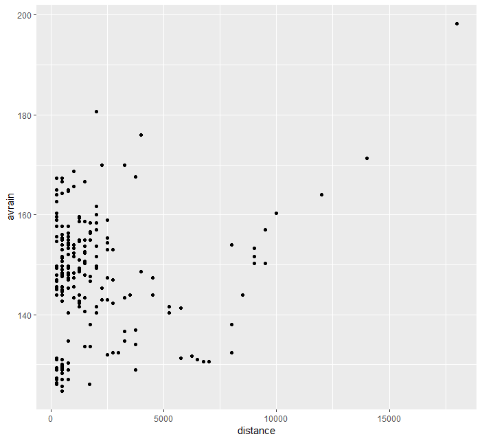
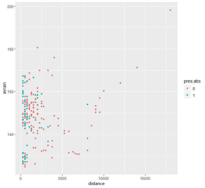
ggplot(data=frogs) creates an empty plotspace on which we build the graphs. + geom_point adds a new layer for scatter plot. mapping = aes() instructs ggplot2 the mapping, i.e. vary the plotting features with given data. x and y specifies the position argument. We can also vary other features with data, e.g. color:
> ggplot(data=frogs) + geom_point(mapping=aes(x=distance,y=avrain, color=pres.abs))
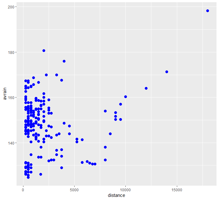
If we don't want to vary color feature with data all we need to do is take it outside the mapping argument (similarly we can do the same with size):
> ggplot(data=frogs) + geom_point(mapping=aes(x=distance,y=avrain),color="blue", size=3)
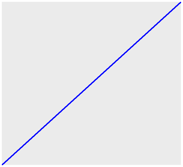
A-B Line Graph
geom_abline is the function to draw simple lines with ggplot2. A simple example is as follows.
> ggplot() + geom_abline(intercept=0, slope=1, size=2, color="blue")
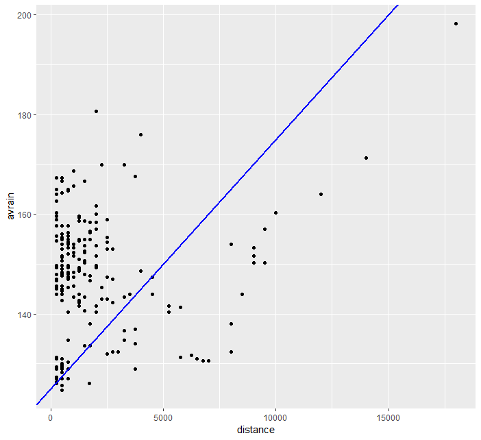
We can overlay our line on top of our previous scatter graph.
> ggplot(data=frogs) + geom_point(mapping=aes(x=distance,y=avrain)) + geom_abline(slope=0.005, intercept=125, size=1, color="blue")
Line Graph
We can plot lines with geom_line function. Take a look at an example below.
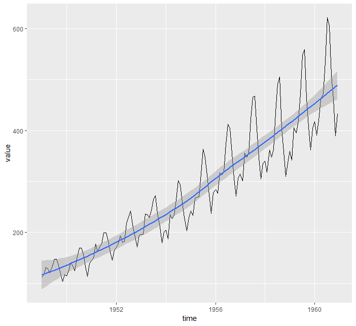
> ggplot(data=airpassenger) + geom_line(mapping = aes(x=time, y=value))

geom_smooth helps us to draw a trend line over this noisy graph.
> ggplot(data=airpassenger) + geom_line(mapping = aes(x=time, y=value)) + geom_smooth(mapping = aes(x=time, y=value), method = 'loess')
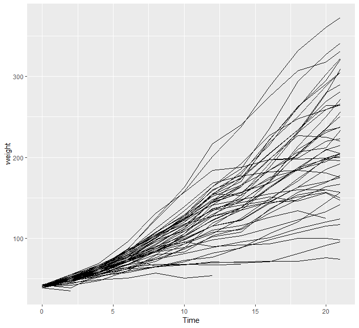
What if we want to separate individual line plots from one another? In that case we use group argument.
> ggplot(data=chick) + geom_line(mapping=aes(x=Time, y=weight, group=Chick))
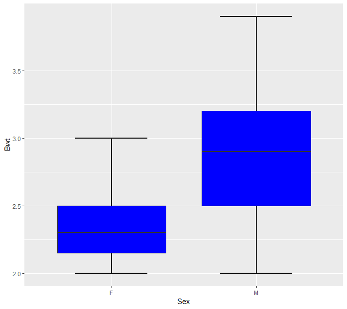
Box Plots
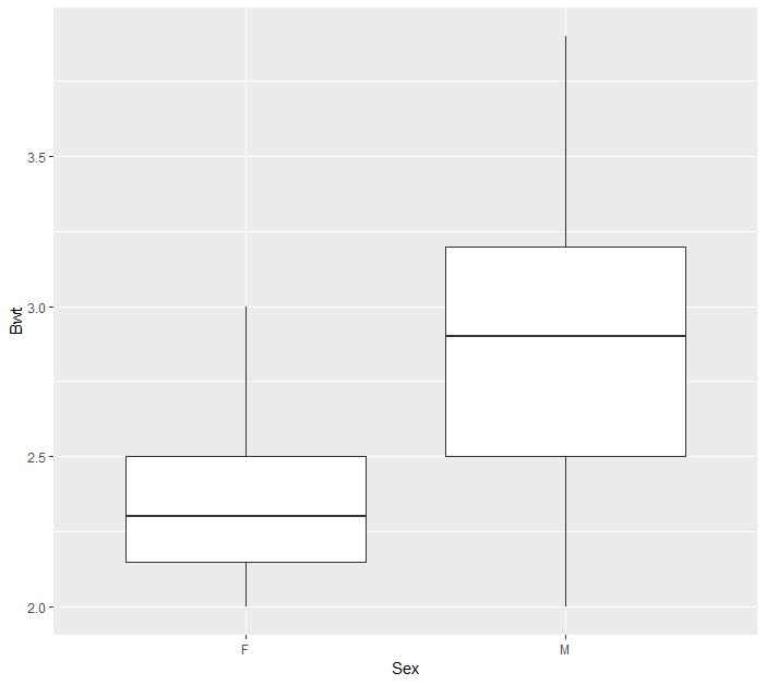
Box plots are indispensable to discover distributions in a simple form. geom_boxplot is the tool to use in R to draw boxplots.
> ggplot(cats, aes(x=Sex, y=Bwt)) + geom_boxplot())
geom_boxplot does not have the option to put caps on whiskers but we can use errorbar option of stat_boxplot
> ggplot(cats, aes(x = Sex, y = Bwt)) + stat_boxplot(geom = "errorbar", width = 0.5, size=1) + geom_boxplot(fill="blue")
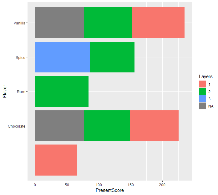
Take a look at the bar chart below. Flipping this chart is as easy as
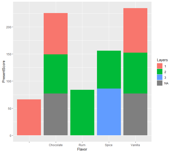
> ggplot(data=cake) + geom_bar(mapping = aes(x=Flavor, y=PresentScore, fill=Layers), stat="summary", fun.y="mean") + coord_flip()
Prev Post
Chi-Square Test

Lrrr
Senior blog writer
Lrrr, ruler of the planet Omicron Persei 8, is a middle-aged Omicronian man with a bad temper and soft spots for the conquering of planets and 20th century television.
Popular Posts

Space The Final Frontier
02 Hours ago

The Amazing Hubble
02 Hours ago

Astronomy Or Astrology
02 Hours ago

Asteroids telescope
02 Hours ago

Leave a Comment