Exploratory Statistics III: Frequency Distribution
freqlist() is a function in arsenal package meant to produce output similar to SAS’s PROC FREQ procedure when using the /list option of the TABLE statement. freqlist() provides options for handling missing or sparse data and can provide cumulative counts and percentages based on subgroups. For this lecture, we will use "marbles" data set. Data set marbles records observations about 10 random draws of marbles from two bags filled with 3 different color marbles. We first need to load the arsenal library (you need to install it if you haven't done so - see prerequisites).
> library(arsenal)
Our data set is in the form of a data frame. To use freqlist function we need to convert this to table format:
> marbletab <- table(marbles$Bag, marbles$Color, dnn=c("Bag","Color"))
Now we are ready to use freqlist function and assign the output to a new variable marblefreq for further analysis.
> marblefreq <- freqlist(marbletab)
And we can see the output with summary function:
> summary(marblefreq)
|Bag |Color | Freq| Cumulative Freq| Percent| Cumulative Percent|
|:---|:-----|----:|---------------:|-------:|------------------:|
|1   |blue  |    8|               8|   13.33|              13.33|
|    |green |   14|              22|   23.33|              36.67|
|    |red   |    8|              30|   13.33|              50.00|
|2   |blue  |   16|              46|   26.67|              76.67|
|    |green |    7|              53|   11.67|              88.33|
|    |red   |    7|              60|   11.67|             100.00|
Barplots and histograms are indispensable to analyze frequency:
									> library(ggplot2)

									> ggplot(data=marbles) + geom_bar(mapping = aes(x=Color, fill=Bag))
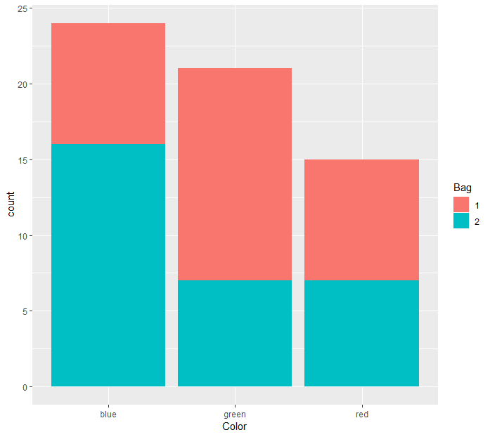
If we want to unstack and plot side-by-side:
> ggplot(data=marbles) + geom_bar(mapping = aes(x=Color, fill=Bag), position='dodge')
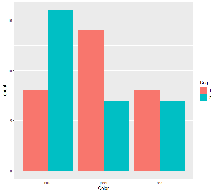
Let's work on another dataset, auto (you can download it from here). Here's what it looks like.

We can see the distribution of mpg with a histogram:
> ggplot(data=auto) + geom_histogram(mapping = aes(x = mpg), binwidth = 3, color='black', fill='blue', alpha=0.5)
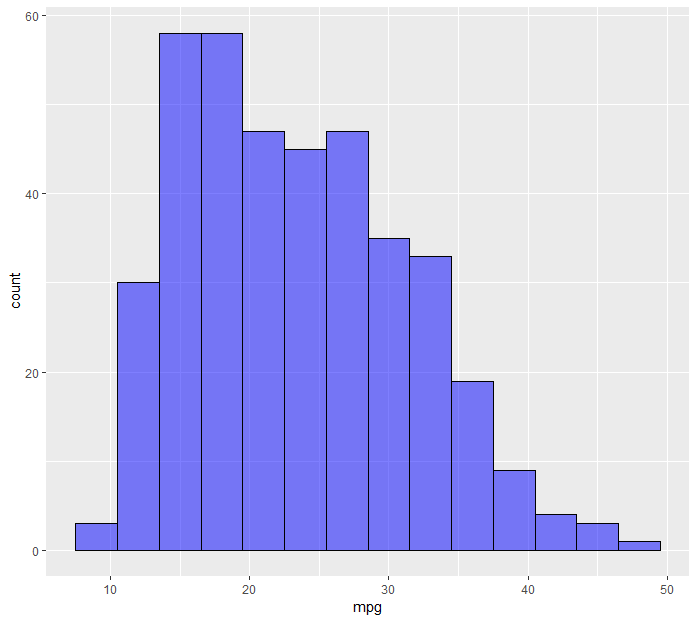
Another option is density plots:
> ggplot(data=auto) + geom_freqpoly(mapping = aes(x=mpg))
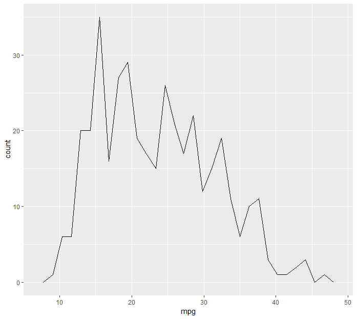
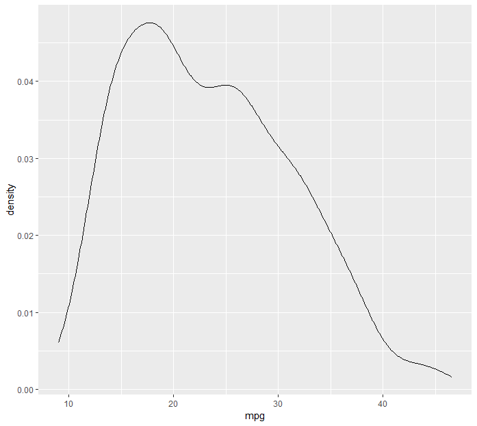
If we want to display density instead of count:
> ggplot(data=auto) + geom_freqpoly(mapping = aes(x=mpg), stat='density')
We can also discover graphically the average mpg for different cylinder numbers.
									> group_by(auto, cylinders) %>%
+ summarize(avgmpg = mean(mpg, na.rm=TRUE)) %>%
+ ggplot() + geom_bar(mapping = aes(x=cylinders, y=avgmpg), stat='identity')
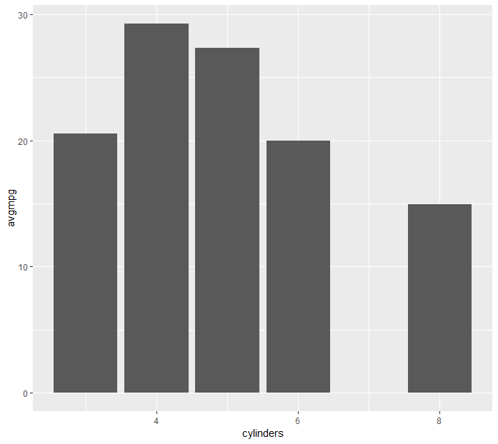
Same thing could have been achieved with the following:
> ggplot(data=auto) + geom_bar(mapping = aes(x=cylinders, y=weight), stat='summary', fun.y='mean')


Leave a Comment