
Graphics
SAS has some great tools in its arsenal for graphing. Here we will look into SGPLOT procedure.
Scatter Plot
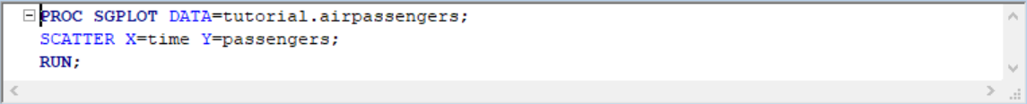
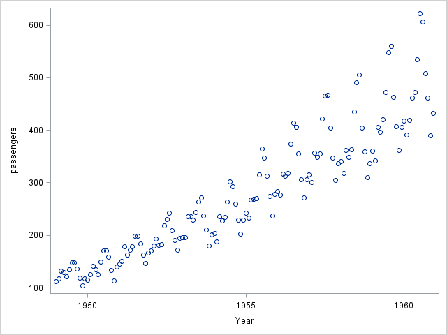
A scatter plot is a type of plot or mathematical diagram using Cartesian coordinates to display values for typically two variables for a set of data. If the points are color-coded, one additional variable can be displayed. The data are displayed as a collection of points, each having the value of one variable determining the position on the horizontal axis and the value of the other variable determining the position on the vertical axis.
One way to plot scatter graphs is by invoking the SGPLOT procedure. Let's take a look at the monthly airline passenger data in the US between 1949 and 1960 (download data set here).
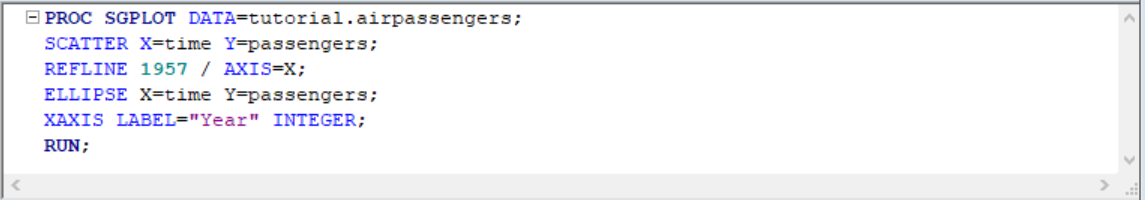
To change the x-axis title we specify its label in a separate line:

Note that x-axis shows decimal values, which might not what we want with year values. To accomplish that, we add INTEGER option to the x-axis statement:
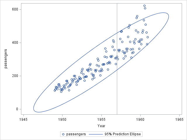
Now let's add a reference line and draw an ellipse over data points:
We can change marker attributes with MARKERATTRS argument:
								PROC SGPLOT DATA = tutorial.airpassengers;

								SCATTER X=time Y=passengers / MARKERATTRS = (COLOR=RED SYMBOL='Square' SIZE=8);

								RUN;
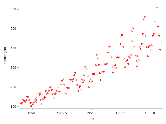
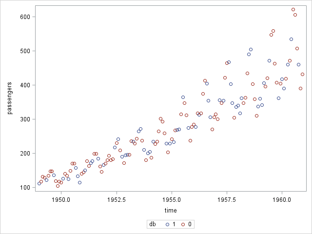
To plot multiple graphs in a single scatter plot for comparison purposes, we can use the GROUP argument. Let's assume that our airline passenger data comes from two sources and we have a column called db(1 or 0). We can plot both together:
								PROC SGPLOT DATA = tutorial.airpassengers;

								SCATTER X=time Y=passengers / GROUP = db;

								RUN;
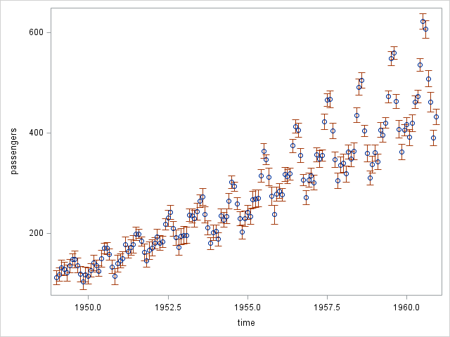
Say, instead of having one data points for each period, we have a lower and upper estimates. We can plot the corresponding error plots with YERRORLOWER and YERRORUPPER arguments:
								PROC SGPLOT DATA = tutorial.airpassengers;

								SCATTER X=time Y=passengers / YERRORLOWER = passlow YERRORUPPER = passhigh;

								RUN;
Bar Graphs
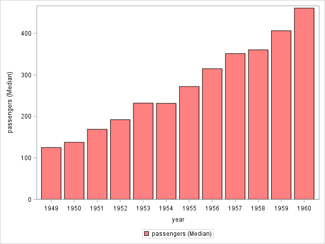
Bar graphs are excellent at summarizing complex data on the go. If you had a chance to look at the airpassenger data we used for scatter plots above, you would notice that the air passenger count is given per month. Let's say we only want to see the year averages. VBAR, HBAR, VLINE and HLINE (V for Vertical and H for Horizontal) arguments of SGPLOT offer such analysis on the go. Here is how we do it:
								PROC SGPLOT DATA = tutorial.airpassengers;

								VBAR year / RESPONSE=passengers STAT=MEAN LIMITSTAT=STDDEV;

								RUN;
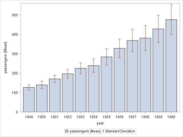
STAT argument tells SAS what kind of aggregate measure it should use calculating the bar size and LIMITSTAT specifies the error bars. Other STAT options are FREQ and SUM. For LIMITSTAT it's confidence bands (CLM) or standard error(STDERR).
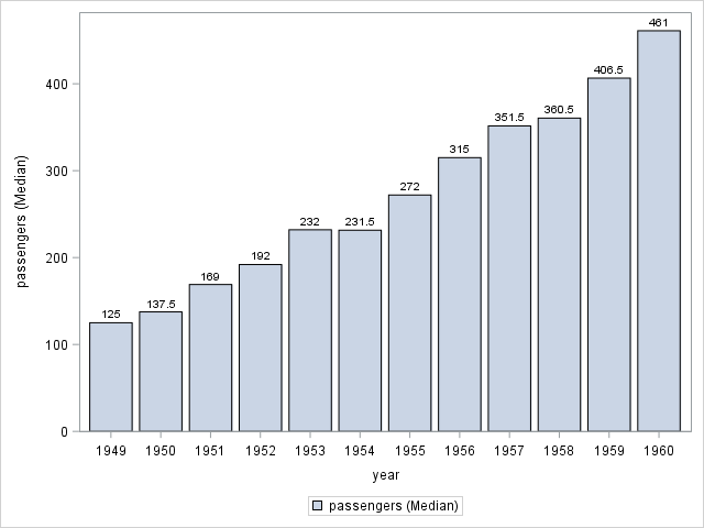
In order to see the calculated values of bar size we have to specify the DATALABEL option:
								PROC SGPLOT DATA = tutorial.airpassengers;

								VBAR year / RESPONSE=passengers STAT=MEAN LIMITSTAT=STDDEV DATALABEL;

								RUN;
Aesthetic features can be modified via either FILLATTRS or LIMITATTRS arguments. Take a look at below to create a red bar
								PROC SGPLOT DATA = tutorial.airpassengers;

								VBAR year / RESPONSE=passengers STAT=MEAN LIMITSTAT=STDDEV FILLATTRS=(COLOR=RED TRANSPARENCY=0.5);

								RUN;
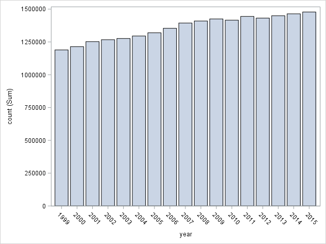
Now let's touch on a bit about how to plot stacked bar charts. For this we will use cancer dataset. This dataset lists the frequency of different cancer cases over the years wrt various age groups and genders. You can download the dataset from here. First let's plot the overall cancer cases over the years:
								PROC SGPLOT DATA = tutorial.cancer;

								VBAR year / RESPONSE=count;

								RUN;
We can create a stack-chart with GROUP argument:
								PROC SGPLOT DATA = tutorial.cancer;

								VBAR year / RESPONSE=count GROUP=sex;

								RUN;
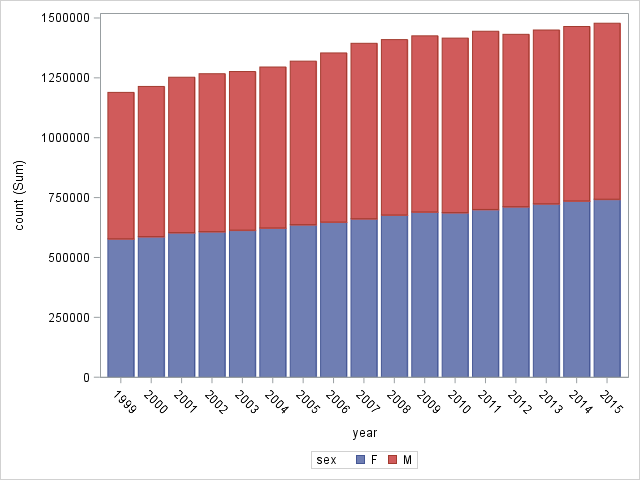
While visually appealing, I find stack charts of little value in terms of communicating data. We can see that overall cancer case is increasing but it's very difficult to tell how it affects different genders. Is the overall increase due to increase of cases in females alone or do males show similar tendency? It's difficult to tell from the graph alone. To see this clearly we have to tell SAS how to plot groups:
								PROC SGPLOT DATA = tutorial.cancer;

								VBAR year / RESPONSE=count GROUP=sex GROUPDISPLAY=CLUSTER;

								RUN;
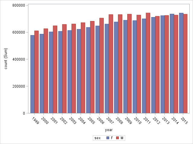
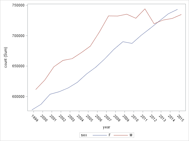
This is much better. An even better option would be to use a line graph instead:
								PROC SGPLOT DATA = tutorial.cancer;

								VLINE year / RESPONSE=count GROUP=sex GROUPDISPLAY=CLUSTER;

								RUN;
Controlling Axis Options
I'd like to introduce axis options before going further with different type of charts especially since these options are applicable to all types of charts.
Let's take a look at anorexia data set (you can download it from here).
First, plot averages of treatment post-weights:
								PROC SGPLOT DATA = tutorial.anorexia;

								VBAR treat / RESPONSE=postwt STAT=MEAN LIMITSTAT=STDDEV;

								RUN;
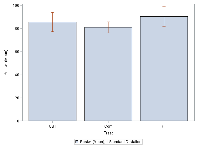
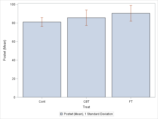
Here is the first problem: control column is in the middle, however we would like to see it in the left side. We can specify this with XAXIS statement:
								PROC SGPLOT DATA = tutorial.anorexia;

								VBAR treat / RESPONSE=postwt STAT=MEAN LIMITSTAT=STDDEV;

								XAXIS VALUES = ('Cont' 'CBT' 'FT');

								RUN;
VALUES argument can also be used with continuous variables. Take a look at below for the scatter plot we have shown earlier but with new XAXIS values:
								PROC SGPLOT DATA = tutorial.airpassengers;

								SCATTER X=time Y=passengers;

								XAXIS VALUES = (1948 TO 1963 BY 5);

								YAXIS VALUES = (0 TO 700 BY 100);

								RUN;


Lrrr
Senior blog writer
Lrrr, ruler of the planet Omicron Persei 8, is a middle-aged Omicronian man with a bad temper and soft spots for the conquering of planets and 20th century television.
Popular Posts

Space The Final Frontier
02 Hours ago

The Amazing Hubble
02 Hours ago

Astronomy Or Astrology
02 Hours ago

Asteroids telescope
02 Hours ago

Leave a Comment