Chi-Sq Test with PROC FREQ
The chi-squared test is used to determine whether there is a significant difference between the expected frequencies and the observed frequencies in one or more categories.
Example: Marbles
Description: Dataset includes randomly selected marbles (3 colors: blue, green, red) from 2 different bags. There is one row per marble.
bag: 1 or 2
color: Blue, green or red.
Download the data from here
Task: Assess the color distribution.
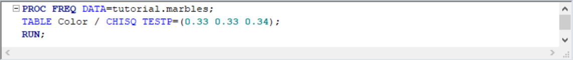
Let's test the assumption that total number of marbles for each color is the same, i.e. P(red) = P(green) = P(blue) = 1/3. To do this we use CHISQ option in the TABLE statement.
Note that P(red) is given 0.34 just to make the total probility equal to 1. Here's our output:
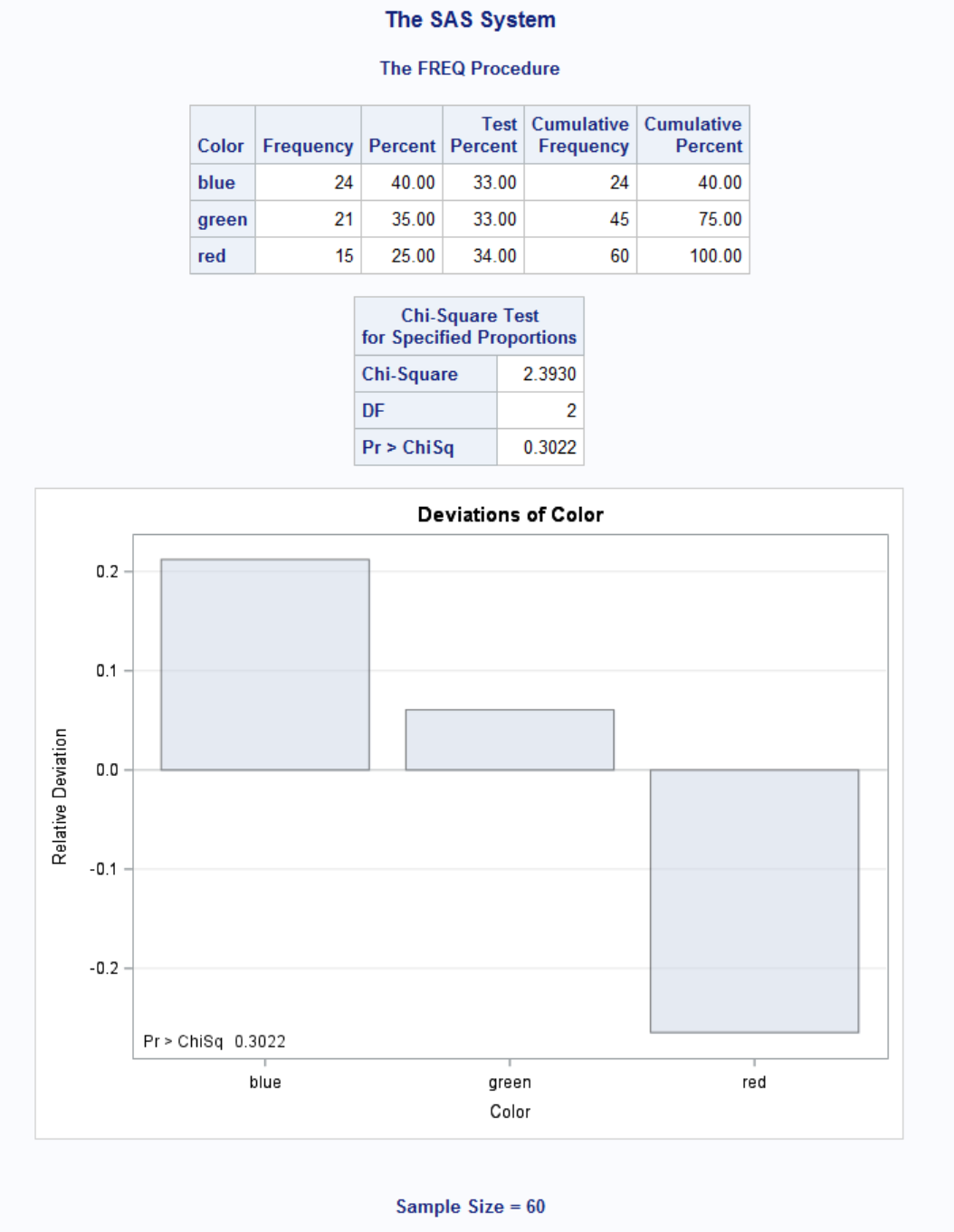
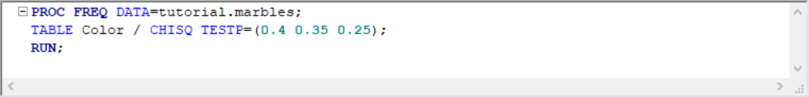
Since our p-value = 0.3022 is bigger than 0.05, our equal probability estimation is close but not perfect. Now let's test P(blue) = 0.4, P(green) = 0.35, P(red) = 0.25:

As expected, Chi-Sq is 0, confirming our distribution estimation.
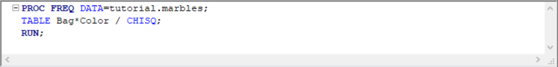
What if we want to test whether two bags are identical in terms of color distribution? To do this:
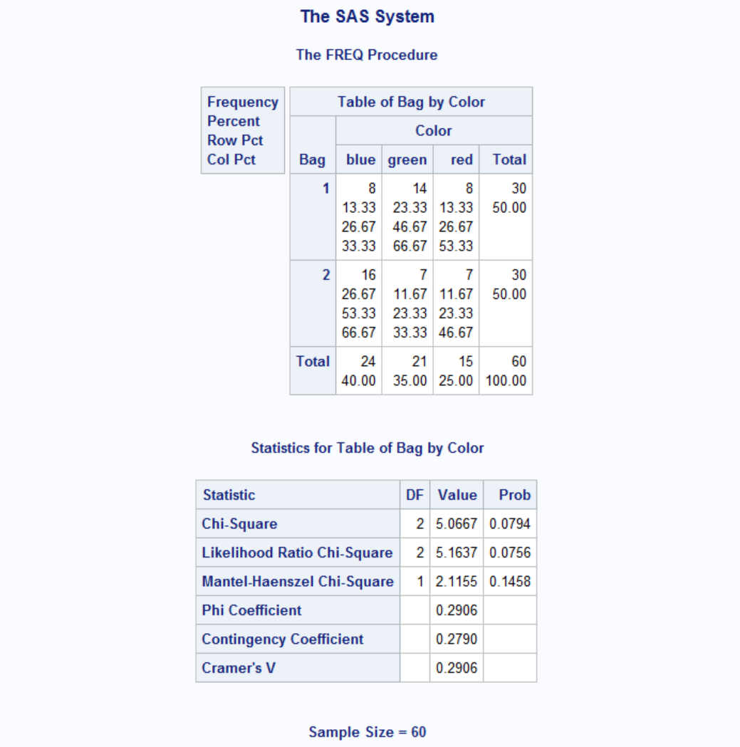
Our p-value is 0.0794 > 0.05 thus we can conclude that the color distributions in bag 1 and bag 2 are different.
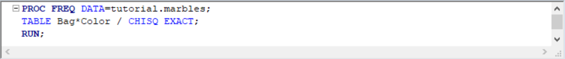
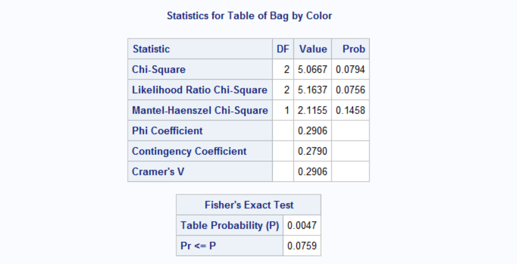
When the sample size is small, we can invoke Fisher's Exact Test for better accuracy.
A better example for Chi-Sq test would be to determine relationship between two variables. Let's say we want to analyze the relationship between traffic warning signs and speeding. You can see the data set explanation here. I created a lighter version of the data in SAS format is here. There are two columns:
- sign: yes or no
- speeding: yes or no
Let's run the test:
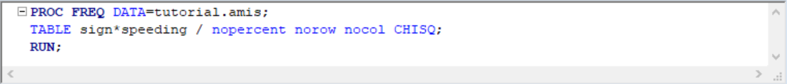
p-value for Chi-Sq is less than 0.05 therefore we can conclude that warning signs have an effect on speeding. Note that we have a relatively large sample size therfore Fisher's Exact Test is not needed.
Relative Risk Measures
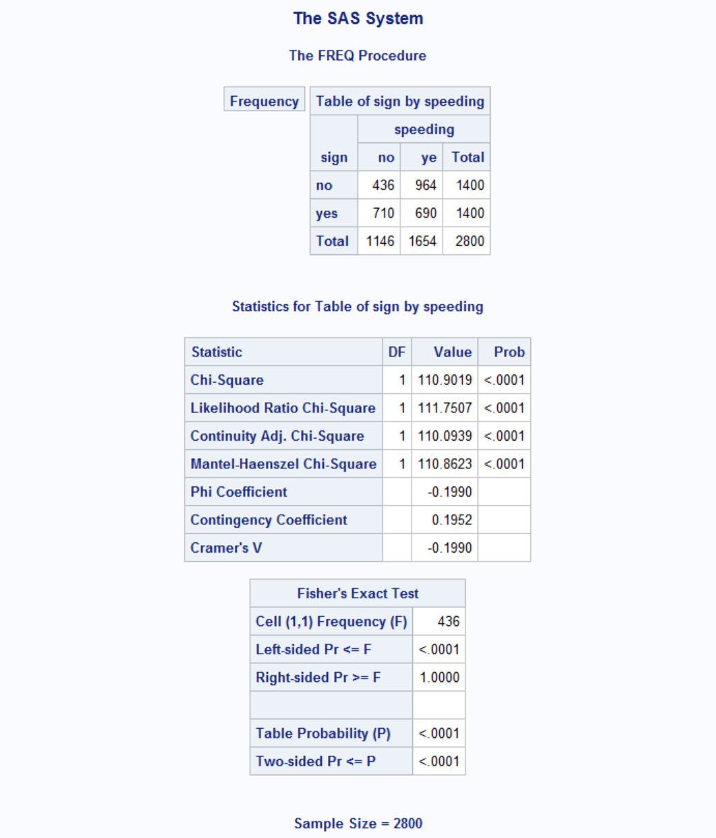
In medical setting, 2x2 tables are constructed where one variable represents presence/absence of a disease and the other is some risk factor. These studies measures odds ratio by retroactive analysis. If subjects are selected by risk factor and watched over for disease then it is called relative risk (vs odds ratio). In both cases, a risk measure of 1 means no risk. If outcome is a disease, >1 means exposure harmful and <1 means beneficial. Let's have an example.
Our example data is from SAS website and you can download a copy of it from here.
| Exposure | Response | Count |
|---|---|---|
| 0 | 0 | 6 |
| 0 | 1 | 2 |
| 1 | 0 | 4 |
| 1 | 1 | 11 |
The data setcontains hypothetical data for a case-control study of high fat diet and the risk of coronary heart disease. The data are recorded as cell counts, where the variable Count contains the frequencies for each exposure (1=high cholesterol diet 0=low cholesterol diet) and response (1=disease 0=no disease) combination.

The odds ratio, displayed above, provides an estimate of the relative risk when an event is rare. This estimate indicates that the odds of heart disease is 8.25 times higher in the high fat diet group; however, the wide confidence limits indicate that this estimate has low precision. However Relative Risk column shows that high cholesterol diet is at least 1.11 times riskier than low cholesterol diet.
Inter-Rater Reliability
Many situations in the healthcare industry rely on multiple people to collect research or clinical laboratory data. The question of consistency, or agreement among the individuals collecting data immediately arises due to the variability among human observers. Well-designed research studies must therefore include procedures that measure agreement among the various data collectors. Study designs typically involve training the data collectors, and measuring the extent to which they record the same scores for the same phenomena. Perfect agreement is seldom achieved, and confidence in study results is partly a function of the amount of disagreement, or error introduced into the study from inconsistency among the data collectors. The extent of agreement among data collectors is called, “interrater reliability”.
A final concern related to rater reliability was introduced by Jacob Cohen, a prominent statistician who developed the key statistic for measurement of interrater reliability, Cohen’s kappa (5), in the 1960s. Cohen pointed out that there is likely to be some level of agreement among data collectors when they do not know the correct answer but are merely guessing. He hypothesized that a certain number of the guesses would be congruent, and that reliability statistics should account for that random agreement. He developed the kappa statistic as a tool to control for that random agreement factor.
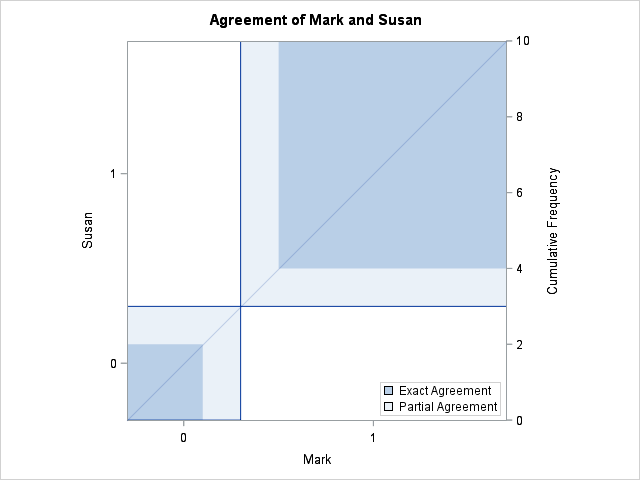
Below is a fictitious data of two raters, Mark and Susan, rating same events. There are agreements (same score) between raters and there are also disagreements (different score) over same events. You can download this data set from here.
| Var# | Raters | |
|---|---|---|
| Mark | Susan | |
| 1 | 1 | 1 |
| 2 | 1 | 0 |
| 3 | 1 | 1 |
| 4 | 0 | 1 |
| 5 | 1 | 1 |
| 6 | 0 | 0 |
| 7 | 1 | 1 |
| 8 | 1 | 1 |
| 9 | 0 | 0 |
| 10 | 1 | 1 |
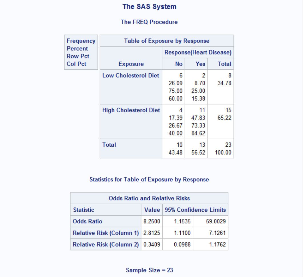
Let's calculate inter-rater reliability statistics of above data with PROC FREQ.

A Kappa value higher than 0.61 typically indicates strong agreement between raters and anything less than 0.20 means poor agreement. Here we have a Kappa value of 0.5238, therefore we can conclude that raters agree moderately. Below is an agree plot also provided by the PROC FREQ statements above.
Example: Dates of Coal Mining Disasters
Description: This data frame gives the dates of 191 explosions in coal mines which resulted in 10 or more fatalities. The time span of the data is from March 15, 1851 until March 22 1962.
date: The date of the disaster. The integer part of date gives the year. The day is represented as the fraction of the year that had elapsed on that day.
year: The year of the disaster.
month: The month of the disaster.
day: The day of the disaster.
Source: https://vincentarelbundock.github.io/Rdatasets/doc/boot/coal.html
Download the data from here
Task: Analyze whether disasters happen randomly or there is a monthly pattern.
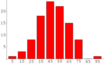
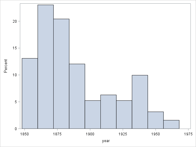
For this task we can use Chi-Sq test for equal proportions. This test would examine whether disasters occured at similar frequencies for each month or not. Note that we don't normally have to use a statistical test for these kind of cases; usually a simple histogram would suffice to show the pattern. Take a look at the number of disasters per year below for example. It is clear that disaster frequency decreases over time, possibly because of better safety measures.
OK, now let's analyze if there is a monthly pattern:

Here's the output:
| month | Frequency | Percent | Cumulative Frequency |
Cumulative Percent |
|---|---|---|---|---|
| 1 | 14 | 7.33 | 14 | 7.33 |
| 2 | 21 | 10.99 | 35 | 18.32 |
| 3 | 19 | 9.95 | 54 | 28.27 |
| 4 | 12 | 6.28 | 66 | 34.55 |
| 5 | 15 | 7.85 | 81 | 42.41 |
| 6 | 10 | 5.24 | 91 | 47.64 |
| 7 | 17 | 8.90 | 108 | 56.54 |
| 8 | 15 | 7.85 | 123 | 64.40 |
| 9 | 11 | 5.76 | 134 | 70.16 |
| 10 | 14 | 7.33 | 148 | 77.49 |
| 11 | 20 | 10.47 | 168 | 87.96 |
| 12 | 23 | 12.04 | 191 | 100.00 |
| Chi-Square Test for Equal Proportions |
|
|---|---|
| Chi-Square | 11.7435 |
| DF | 11 |
| Pr > ChiSq | 0.3832 |
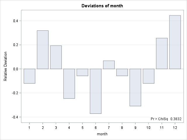
We can see from the deviation graph that disasters tend to happen at colder weather with the exception of January. Also Chi-Sq test tells us that proportions are not equal.
McNemar's Test
In statistics, McNemar's test is a statistical test used on paired nominal data. It is applied to 2 × 2 contingency tables with a dichotomous trait, with matched pairs of subjects, to determine whether the row and column marginal frequencies are equal (that is, whether there is "marginal homogeneity"). It is named after Quinn McNemar, who introduced it in 1947. You can think of McNemar's test as kind of a Chi-Sq test suitable for paired data (e.g. before/after results).
Take a look at the table below. It shows a study evaluating the effect of a weight-loss product.
| Overweight / After | |||
|---|---|---|---|
| Yes | No | ||
| Overweight / Before | Yes | 56 | 55 |
| No | 28 | 29 | |
Is the product effective? Let's test this both with chi-sq and McNemar's test.
								DATA ow;

								INPUT before $ after $ n;

								DATALINES;

								over	over	54

								over	normal	55

								normal	over	28

								normal	normal	29

								;

								RUN;


								PROC FREQ DATA=ow;

								TABLE before*after / CHISQ AGREE NOROW NOCOL NOPERCENT EXPECTED;

								RUN;
|
|---|
| Table of before by after | |||||||||
|---|---|---|---|---|---|---|---|---|---|
| before | after | ||||||||
| normal | over | Total | |||||||
| normal |
|
|
|
||||||
| over |
|
|
|
||||||
| Total |
|
|
|
||||||
| Statistic | DF | Value | Prob |
|---|---|---|---|
| Chi-Square | 1 | 0.0266 | 0.8706 |
| Likelihood Ratio Chi-Square | 1 | 0.0266 | 0.8706 |
| Continuity Adj. Chi-Square | 1 | 0.0000 | 1.0000 |
| Mantel-Haenszel Chi-Square | 1 | 0.0264 | 0.8709 |
| Phi Coefficient | 0.0126 | ||
| Contingency Coefficient | 0.0126 | ||
| Cramer's V | 0.0126 |
| Fisher's Exact Test | |
|---|---|
| Cell (1,1) Frequency (F) | 29 |
| Left-sided Pr <= F | 0.6277 |
| Right-sided Pr >= F | 0.5000 |
| Table Probability (P) | 0.1277 |
| Two-sided Pr <= P | 1.0000 |
| McNemar's Test | |
|---|---|
| Statistic (S) | 8.7831 |
| DF | 1 |
| Pr > S | 0.0030 |
| Simple Kappa Coefficient | |
|---|---|
| Kappa | 0.0119 |
| ASE | 0.0731 |
| 95% Lower Conf Limit | -0.1313 |
| 95% Upper Conf Limit | 0.1551 |
You can see from results above that while Chi-Sq is insignificant, McNemar's test is highly so. This is because McNemar's test basically evaluates the difference between number of people going from overweight to normal and vice versa. The higher the difference, the more significant is the result. To see this effect more clearly, let's change the number of people who were overweight before the study and normal after the study while keeping everything else intact and watch the p-value of chi-sq and McNemar's tests.
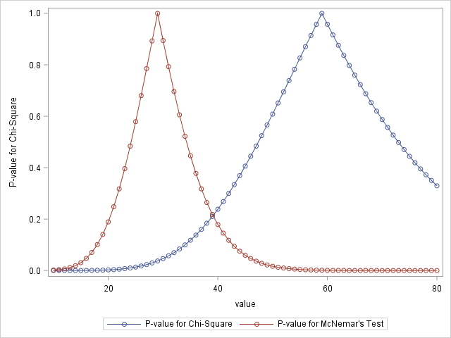
As the number gets closer and closer to 28 (number of people who were normal before and overweight after) McNemar's test becomes less and less significant. On the other side, chi-sq test gets less significant around 58. This is because Chi-sq tests the ratio before (over_before/normal_before vs. over_after/normal_after). Therefore Chi-Sq test fails when the samples are not independent whereas McNemar's test shines.

Lrrr
Senior blog writer
Lrrr, ruler of the planet Omicron Persei 8, is a middle-aged Omicronian man with a bad temper and soft spots for the conquering of planets and 20th century television.
Popular Posts

Space The Final Frontier
02 Hours ago

The Amazing Hubble
02 Hours ago

Astronomy Or Astrology
02 Hours ago

Asteroids telescope
02 Hours ago

Leave a Comment